As a designer, it is essential to know when to use RGB vs CMYK – CMYK: cyan, magenta, yellow, and black (In the printing press days when plates were being used the black plate was typically call the “key” plate because it carried the important key information relating to the artistic detail). RGB: red, green, blue colors on projects. A good rule of thumb is anything dealing with the web should always be in RGB. Printed material should be in CMYK. A very few designers and clients know why this is the standard.
Here’s why…
Back in the printing press days, to achieve color, each ink
(cyan, magenta, yellow, and black) had its own plate. First
the printer would lay down one color, wait for it to dry, lay
down another color, wait for it to dry and so on. Printing
presses still work on that same theory to this day. The
exception is that offset printers can use a “spot” color whichcan be added to achieve a specific color swatch (usually a Pantone color). As the printing age has progressed, the digital printer has come a long way, allowing to print in RGB a s well. But the standard still stays the same – use CMYK on all printing needs, as the color will appear differently if printed in RGB.
On the other end, computer monitors give off colored light known as RGB (CMYK is colored ink). Computer monitors have a larger color gamut than printing, which is why a computer can display a million more colors than what can be achieved with printing. Printing deals with absorption and reflection of wavelengths of which we perceive as color (CMYK). Printing also has its own limited color gamut. A lot of times customers will note that something looked different on screen than it does on paper and it is because of the different color ranges that computer monitors and printing allows.
To go into further depth, RGB colors are also known as “additive color”, because there are no colors and the colors are being added together to achieve further colors or until the outcome is white (look at the color chart image directly below, the inside color is white because it is all the colors added together). This is because our eyes receive no
reflected light and they perceive the color to be black. However, when you add portions of red + green + blue the outcome is the CMYK colors as shown below.
RGB COLORS ARE ADDITIVE
While in return, subtract cyan – magenta – yellow – black and you will get the RGB colors. CMYK colors are subtractive for this very reason that it starts with all colors and when colors are subtracted the outcome is white (see below color swatch, the inside color is black). This is because the colors absorb the light.
CMYK COLORS ARE SUBTRACTIVE
To further summarize what has been discussed, when it comes to deciding to use RGB vs CMYK, first figure out what the output will be. If the output will be on a computer monitor then RGB is the way to go. If the piece will be printed, CMYK is usually the standard and the best option. Thats all there is to it when it comes to using RGB vs CMYK colors on your projects.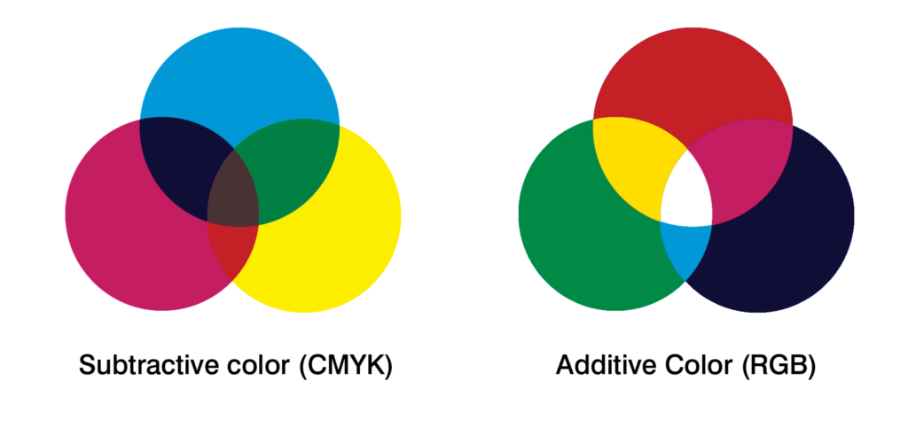
Raster vs Vector
Bitmap (raster/jpeg) graphic file is a rectangular area composed of pixels, i.e. tiny squares of specific colours. Every shape is composed of thousands of pixels which is why we cannot see individual squares while looking at a bitmap image. What we save as a bitmap are all photographic images and, for instance, files displayed on web pages (with the exception of Flash animations, which may combine both raster and vector elements). You can only scale down (reduction in size) raster graphics (jpeg images) and not lose quality. While you are scaling up a bitmap on the screen (zooming) you sooner or later see individual pixels, being large one-colour squares. In order to use raster graphics for high quality printouts you need very high resolutions (dimensions) of even several thousands of pixels. On the other hand, vector graphics contains shapes composed of curves (vectors) and fillings. That is why projects delivered in a vector form can be freely scaled (enlarged or reduced) with no harm to their quality. Vector formats are the best for logos: such a file may be used both on a business card and on a billboard. You can easily get a raster file from a vector file. The reverse is very complicated and not always possible. The changing of a bitmap into vectors is called vectorization or digitalization.
DIFFERENCES
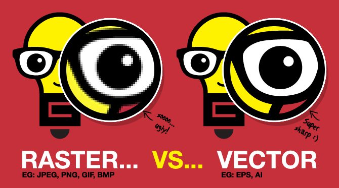
As you can see in the images above, one is a bitmap image (raster/jpeg) and the other is a vector image. Let me just simplify the above text. If a customer brings in a file in a jpeg format, it has to be at the size that is required for printing, ie. Printing an image on a t-shirt, the original image must be approximately the same size as the final product. If the image you want to print is only 2” x 2” and then increase it’s size to fit the t-shirt, expect to have pixelation like the image on the left above. When searching the internet for images, look for ones that are a minimum 1024×768 in the description. You can reduce the size of an image with no pixelation but when you increase the size there will definitely be pixelation. One exception to this rule are images taken by a camera (not a cell phone camera). Most new cameras are 10 megapixels or more. Raster file types: JPEG, PNG, TIFF, there are others but the list is too long to include in the document.
Vector images are different curves or shapes to create the image and can be enlarged and reduced in size with no pixelation ( distortion ). A business card that is in a vector format (provided that all objects are vectorized) can be enlarged to any size without losing any detail ( second image ). Vector file types: AI (Adobe Illustrator), EPS (Adobe Illustrator, Adobe Photoshop), most PDF’s, CDR (Corel Draw), and SVG (Scalable Vector Graphics).
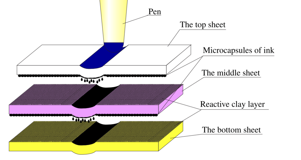
NCR paper (No Carbon Required)
NCR paper consists of sheets of paper that are coated with micro-encapsulated dye or ink or a reactive clay. The back of the first sheet is coated with micro-encapsulated dye (referred to as a Coated Back or CB sheet). The lowermost sheet is coated on the top surface with a clay that quickly reacts with the dye to form a permanent mark (Coated Front, CF). Any intermediate sheets are coated with clay on top and dye on the bottom (Coated Front and Back, CFB).
When the sheets are written on with pressure (e.g., ball-point pen) or impact (e.g., typewriter, dot-matrix printer), the pressure causes the micro-capsules to break and release their dye. Since the capsules are so small, the resulting print is very accurate.
Carbonless copy paper was also available in a self-contained version that had both the ink and the clay on the same side of the paper.